Visual Unity
|

|
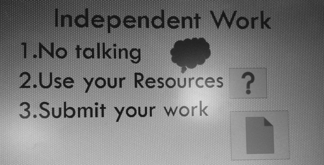
Visual unity is intended to reduce cognitive effort, create a focused message, and improve the aesthetic experience. The graphic on the left is a list of rules that students should follow when working in the independent station during blended learning rotation. The graphic on the right displays the same list of rules. On the left, the graphics chosen to represent the rules are different sizes, odd shapes, and don't necessarily align with the rule being presented. The new graphic on the right gives three graphics that are the same size and nature. They are directly aligned to the instruction that is being given. The original gives a list of rules, however on the right, each rule has a box around it. There is sufficient white space to give each of the rules enough meaning, but the boxes around each rule give the viewer a feature that distinguishes the rules from the others and creates visual unity by allowing the reader to follow the path, from top to bottom, of the intended rules. There is not cognitive overload because students do not have to decipher why the graphic was chosen to go with the words. Overall, the graphic on the left is dull and boring, while the visual on the right is aesthetically pleasing, making it align to the goals of visual unity.
