Visual Hierarchy

|

|
The graphic on the left uses full sentences, and only distinguishes the importance of the equation, not the title. It is imperative that students understand what slope-intercept form is and what the individual parts of the equation mean. The graphic on the left is a list of important information, the improved graphic on the right draws the viewer to the equation and the name of the equation at the same time, by showcasing them as the primary visual, a larger circle with ample white space draws the viewer to large circle. The circle is also located near the top left, where a viewers eye is naturally drawn. On the left, there is not sufficient white space separating information and the bullet points blend together. On the right, each of the secondary circles gives ample white space for each of the components of the equation and also provides an easy to understand definition. Only key words are used to limit cognitive overload and signal the viewer to pertinent information. On the left, the summary of the equation is provided throughout the bullets, however on the right, the summary has been provided on the left as it may not be pertinent to all viewers, and once viewers have a better understanding of the equation, they will only need the circles to cue memory of certain components of the equation. The graphic on the left could be overwhelming to grade level learners, while the new graphic on the right is less overwhelming for those struggling with reading, and/or mathematical content. Cognitive overload is limited and students can focus on key information only, while not be overloaded by extraneous vocabulary.
Visual Cue

|
|
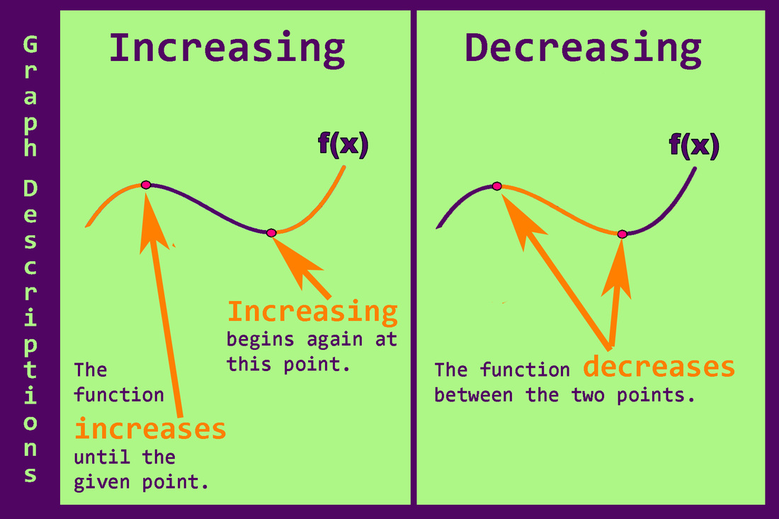
For the graphic on the left there are so many visual cues, that the viewer becomes easily distracted by the colors, the arrows, and the unnecessary references to y. The graphic is overwhelming and confusing for the viewer. On the right, the information regarding where the function is increasing or decreasing is pointed out using two visual cues, first a contrasting color and font sizer are used to show where the function is increasing (or decreasing) and second, arrows point to the points that are either the starting or stopping points of the increasing (or decreasing) parts of the function. The visual cues are all orange which contrasts against the background, and is also inline with the use of orange for action throughout the series of curriculum posters. The design on the left is overcrowded creating cognitive overload for the learner. On the right, extraneous and repeated information has been omitted for a clear and easy to understand graphic. Students can focus their attention on the description of the function and will not become overwhelmed by the sleek design.
