Typography

|
|
The typeface on the left is a script, and according to Malamed, should be avoided for instructional purposes. As you can see in image above, the words are hard to read. On the right, a serif typeface was chosen because the graphic is going to be a poster; readers will have an easier time focusing cognitive processes on the content and will not be required to use cognitive process to process the typeface. On the left there is no white space to differentiate the definition from the example. In the new graphic, ample white space is provided between the written definition and the example. On the left the border is random and has no relationship to the text, on the right the border and background have been chosen to align with a series of classroom posters and digital files. There is sufficient contrast among the type and the solid background. Again, the overall readability of the graphic on the left is straining and will cause students to be cognitively overloaded as their brains spend time deciphering the text. On the right, the student will be able to focus all cognitive attention on the content being displayed as they typeface facilitates readability and minimizes cognitive overload.
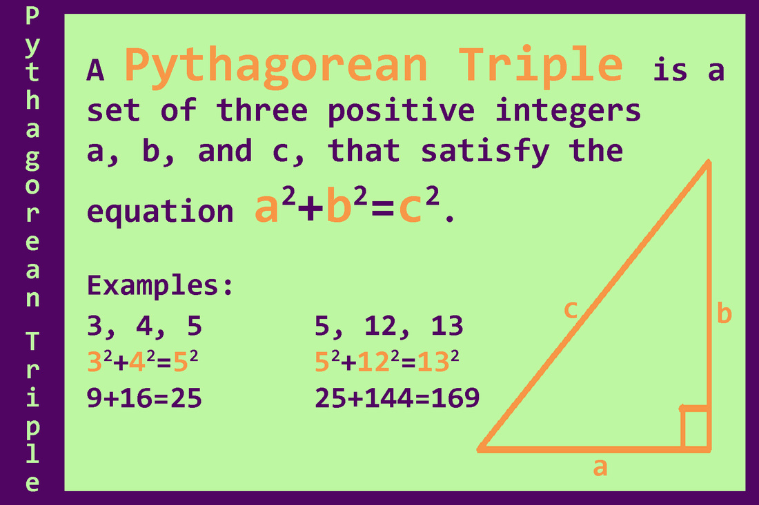
Color

|

|
The graphic on the left is black and white, with color only used to highlight the title. There is no contrast and white space is not sufficient to differentiate all of the concepts. The white space is inconsistent which can cause some confusion for the viewer. For this project a triadic color palette was chosen. The color palate is used throughout the sequence of of the graphic design project. The purple was chosen as the dominate color and is responsible for the teaching information. Since darker colors elicit dominance, the color was intentionally chosen to pull viewers to that information. This also helps with students who have impaired vision in regards to color. The contrast is sufficient enough between the green and purple, that the reader will be drawn to the written text. Green was chosen as the accent color and offers a calm background for the information to be displayed on. The orange in the graphic highlights the key points from the content by portraying examples. The colors have the same responsibility in each of the graphics presented so that the viewer is not confused by the color. White space is used, along with borders, to differentiate the properties of different triangles. The names of the triangles on the same size as the properties of those triangles and there is not much to distinguish the information. The graphic on the right has clearly identified triangles, properties, and examples.
